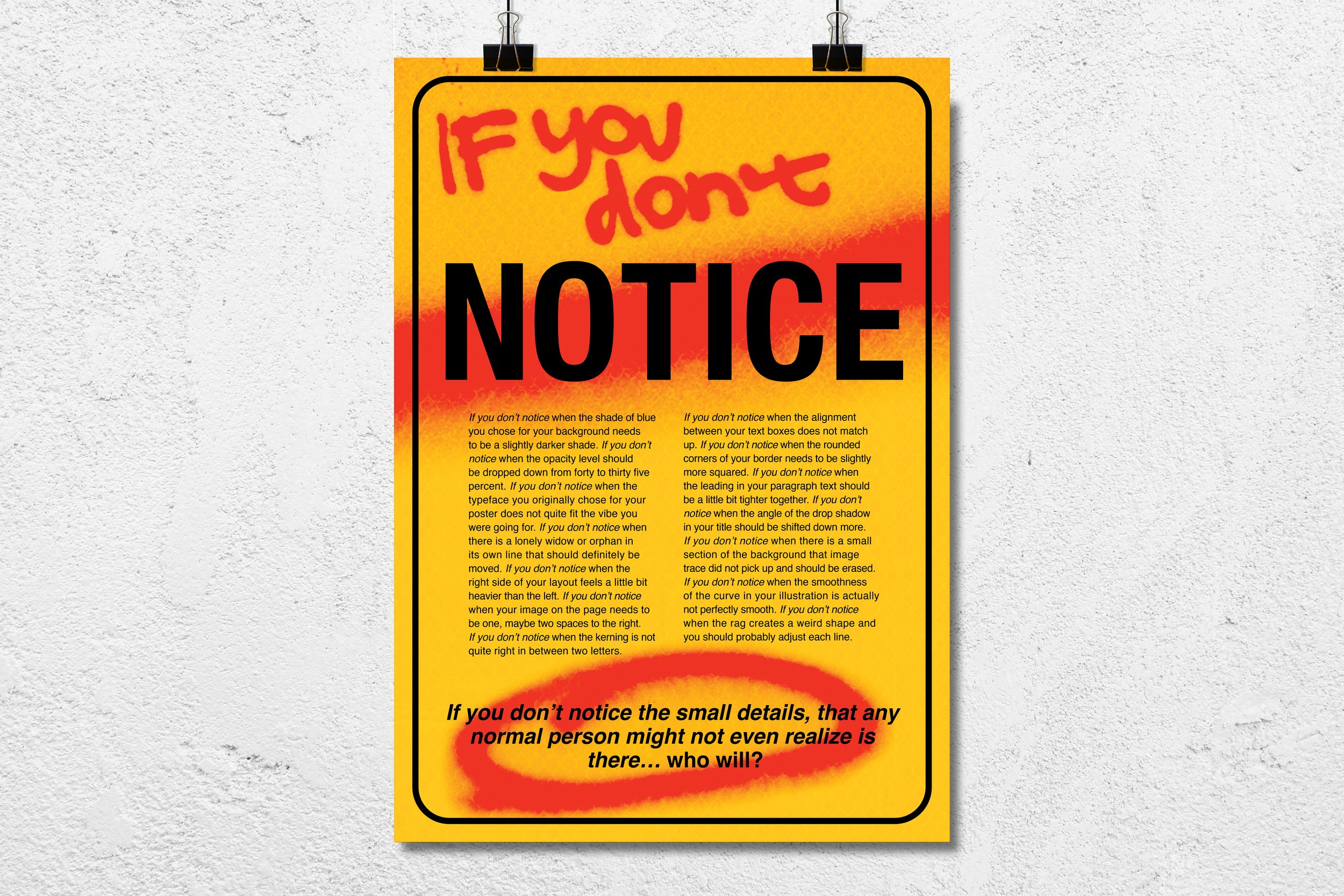
IF YOU DON’T NOTICE
Design Manifesto
Project Background:
This project involved writing and designing a personal manifesto that articulates my perspective on graphic design through both language and typography. I developed a written manifesto with intentional word choice, tone, and typographic selection, then translated its themes into a large-scale, primarily typographic poster. The final piece uses hierarchy, composition, and color to visually reinforce the message and demonstrate how design can amplify written ideas.
Research & Direction:
I chose to write my manifesto about being a perfectionist, but rather than seeing it as a flaw, I focused on how it makes me a stronger designer. The copy is written repetitively, emphasizing all the small, precise details that go into making a design truly “just right.” As designers, it’s important to notice the things that most people might not even realize. To me, this attention to detail is what sets us apart and is one of the main reasons we’re in this field, to create work that looks thoughtful, polished, and perfectly crafted.
Results:
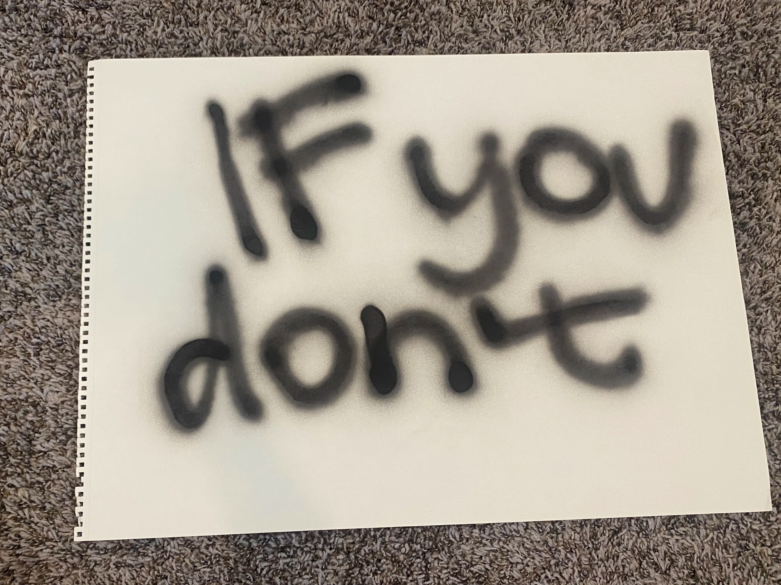
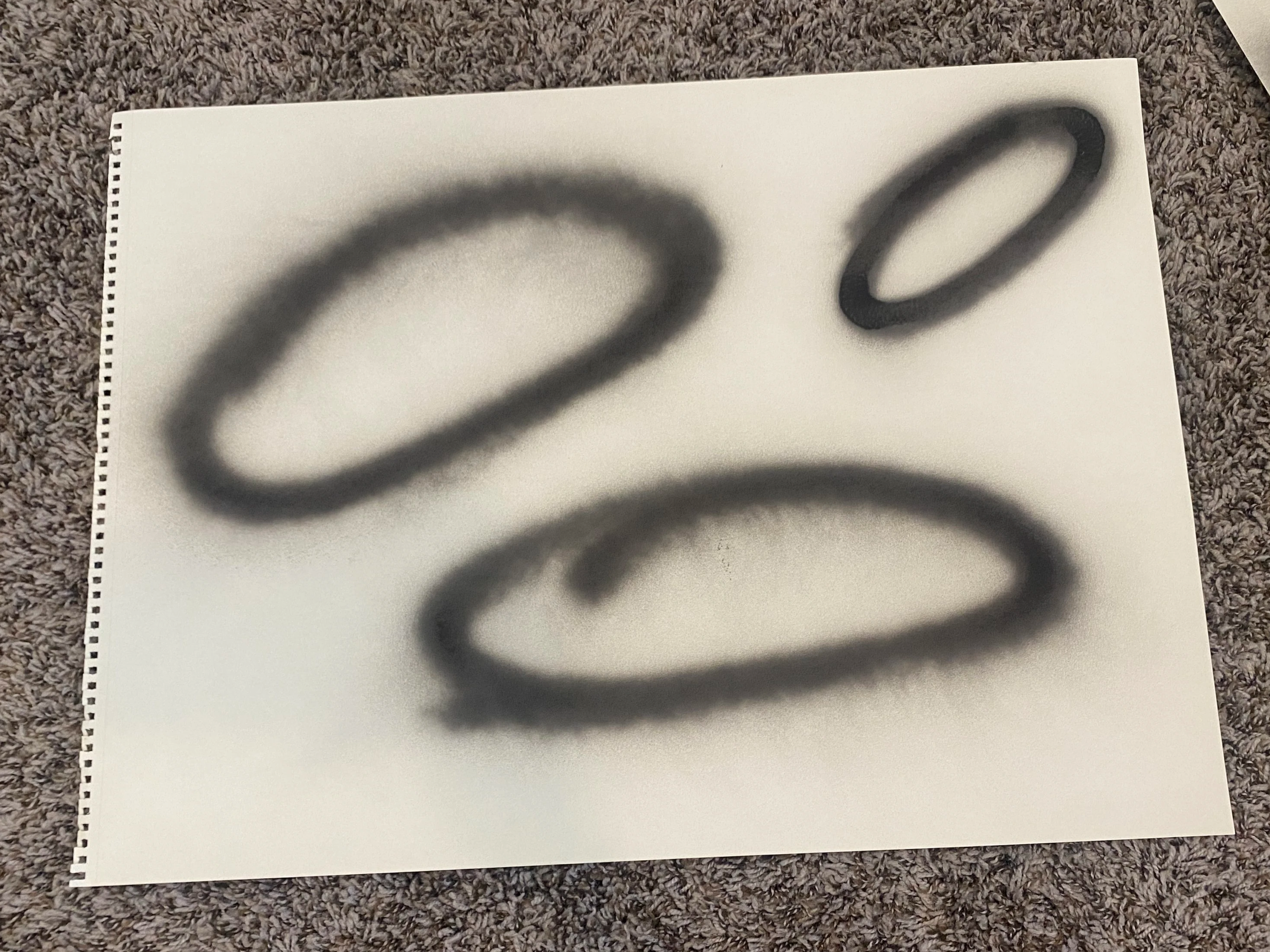
For the final poster, I wanted to really emphasize and dramatize the idea of “noticing.” I drew inspiration from a yellow warning sign and added a spray paint effect to give the design energy and texture. To make the spray paint look authentic, I actually used real spray paint to write the words and draw the circle by hand. This added a tactile, hand-crafted element that contrasts nicely with the bold, clean black type, while the bright red of the spray paint creates a striking, attention-grabbing focal point.
Typography, Poster Design