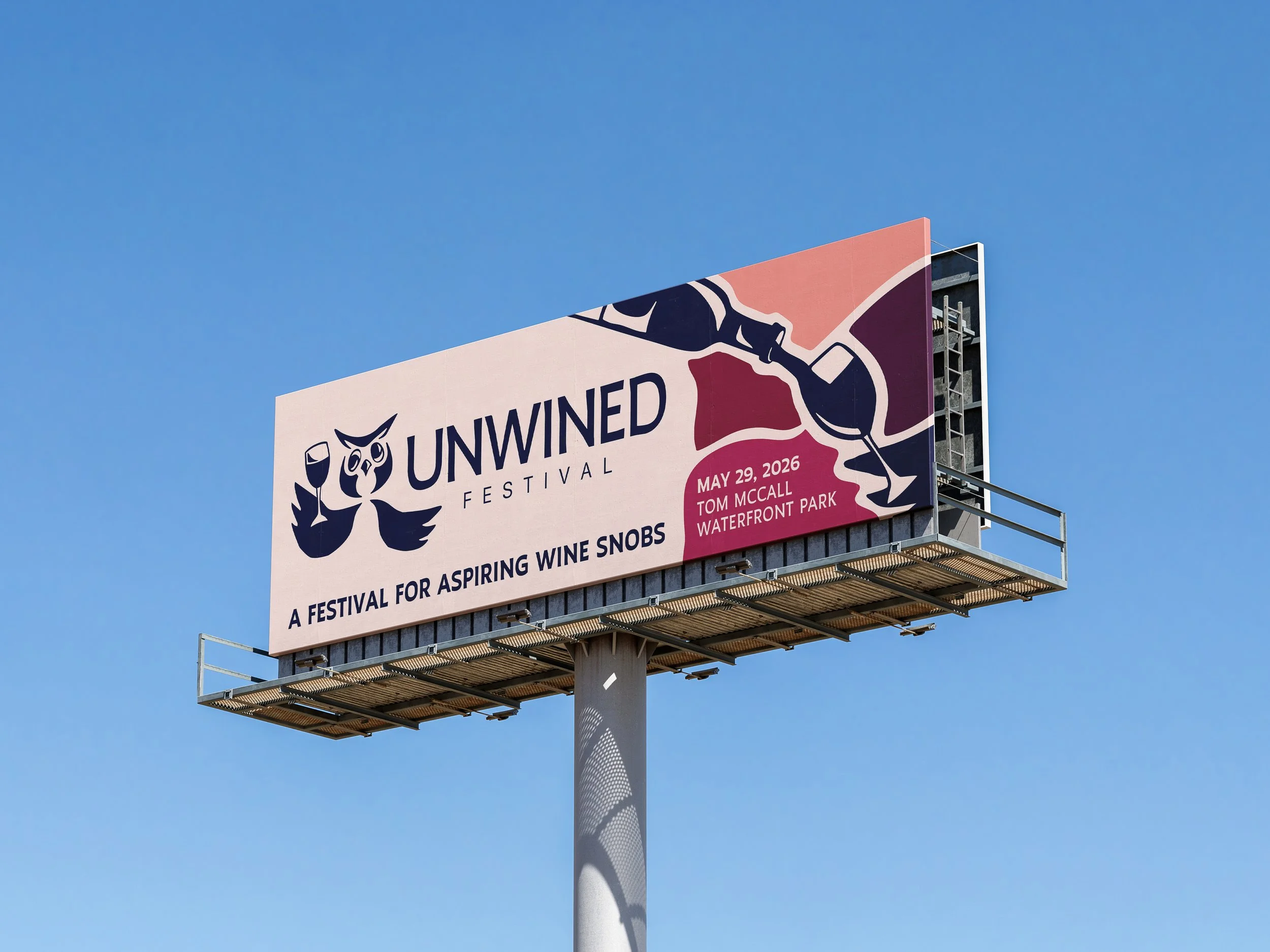
UNWINED FESTIVAL
Event Branding
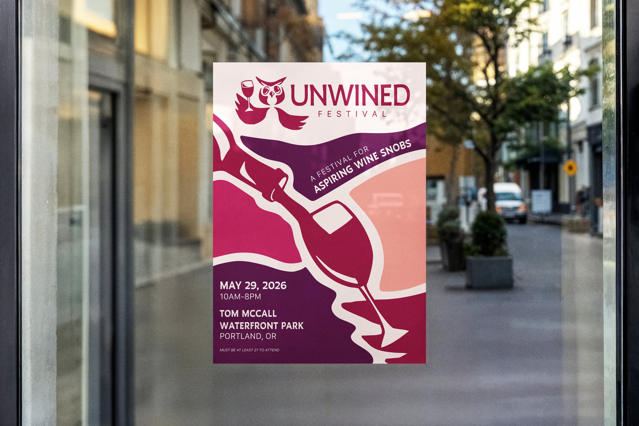
Project Background:
This project focused on designing a branded campaign for a chosen event, emphasizing how visual identity can build anticipation and create a cohesive experience across multiple touchpoints. I defined the event’s concept, audience, and purpose, then developed a unified brand system that communicates key information and enhances the experience before and during the event.
Research & Direction:
This event is targeted toward young adults (21+) who are curious about wine and want to learn more about tastings, pairings, history, and everything in between. The idea came from my own appreciation for wine and its more sophisticated side, but also from feeling totally overwhelmed at traditional wine festivals, where it seems like everyone already knows exactly what they’re doing. These people are what I like to call wine-snobs. This festival is designed for the aspiring wine snobs: people who want to learn, explore, and enjoy wine in a welcoming, fun, and pressure-free environment.
Results:
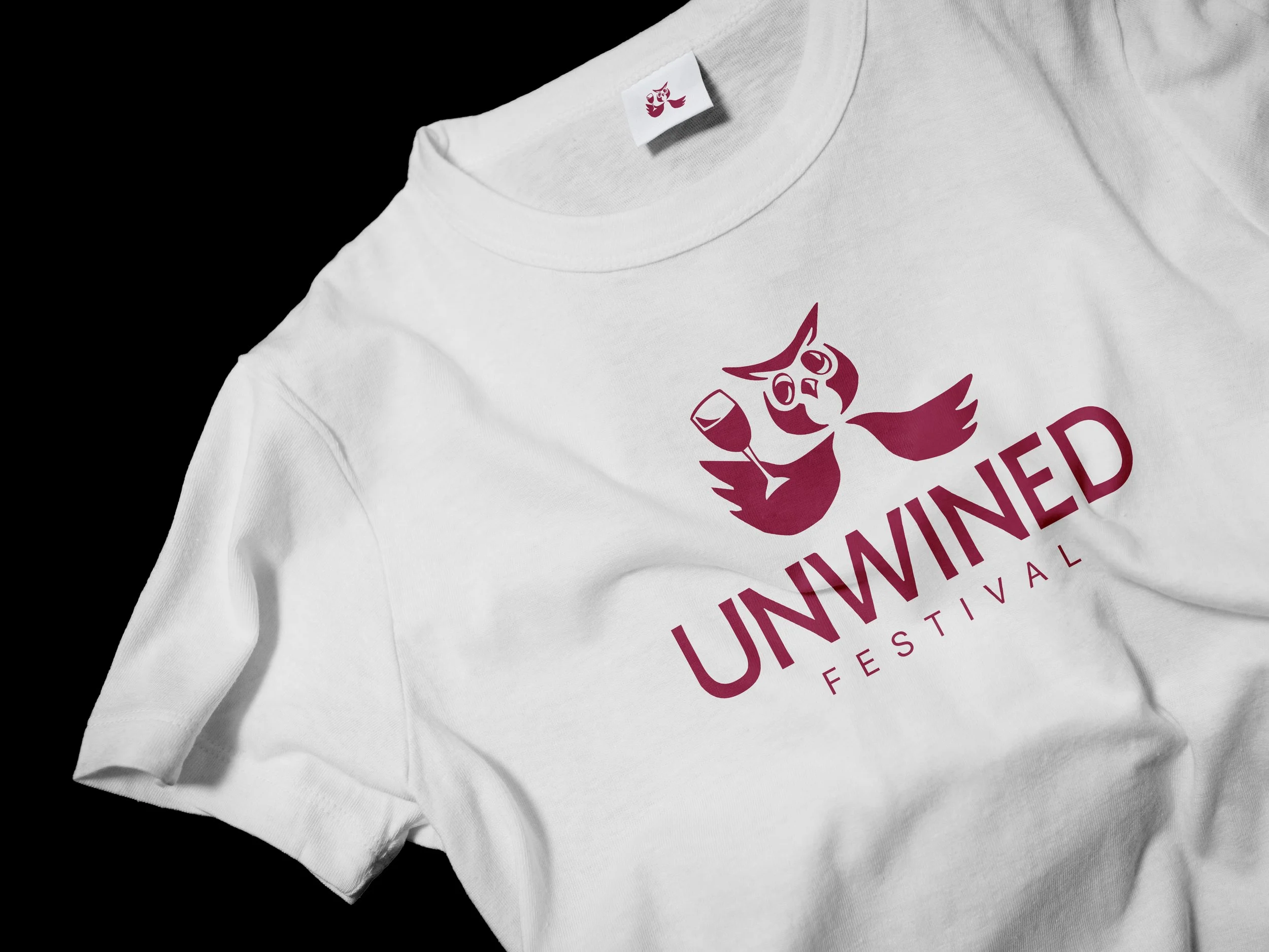
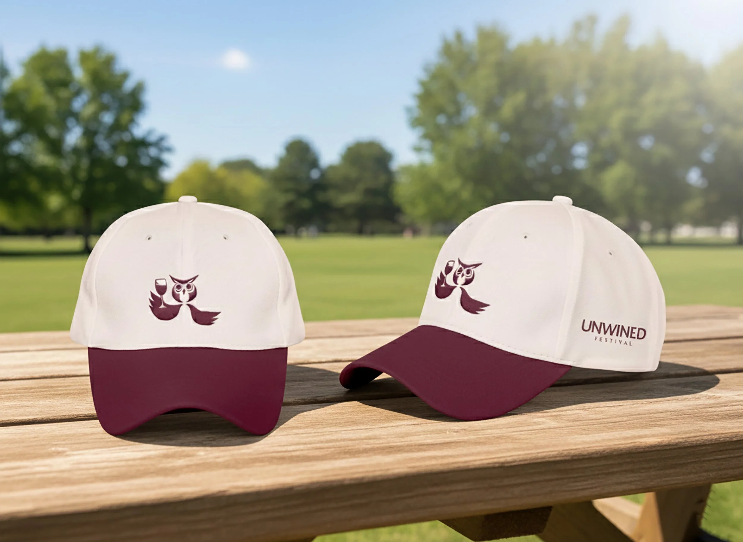
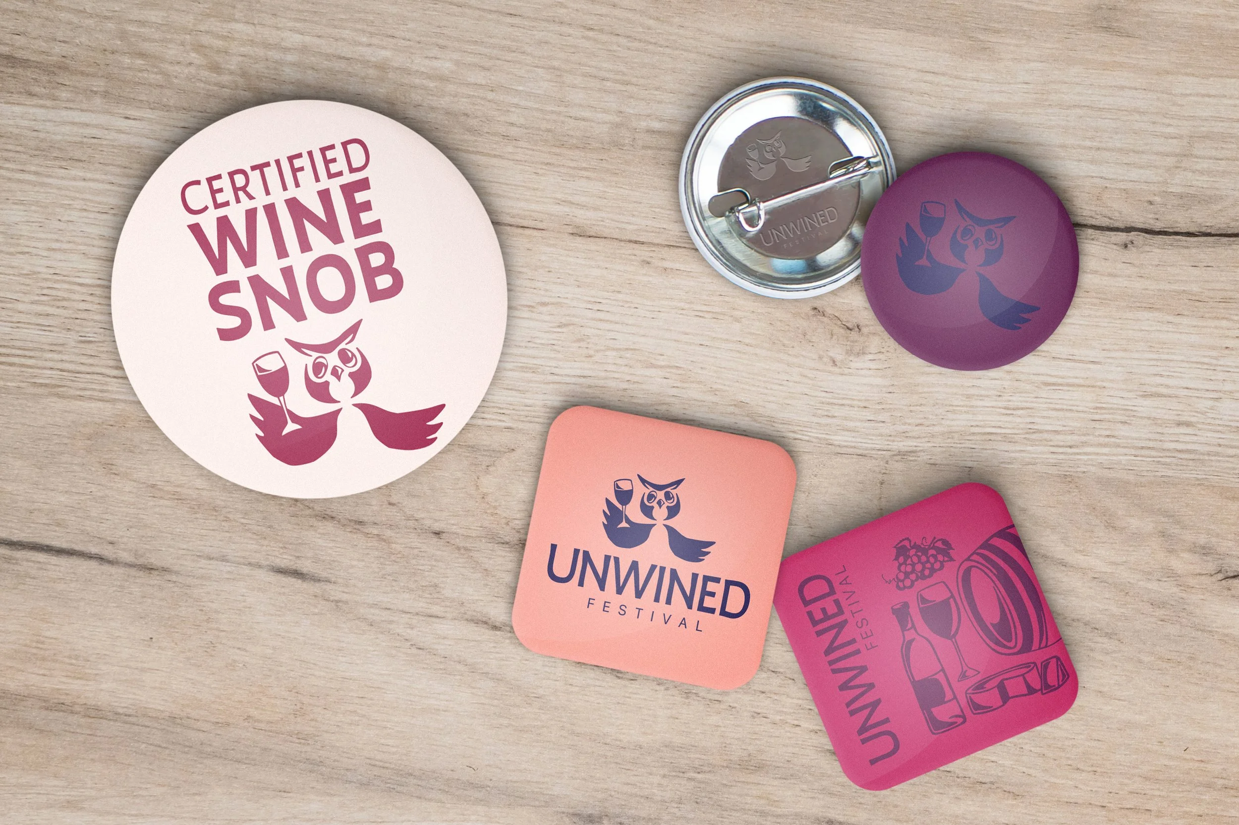
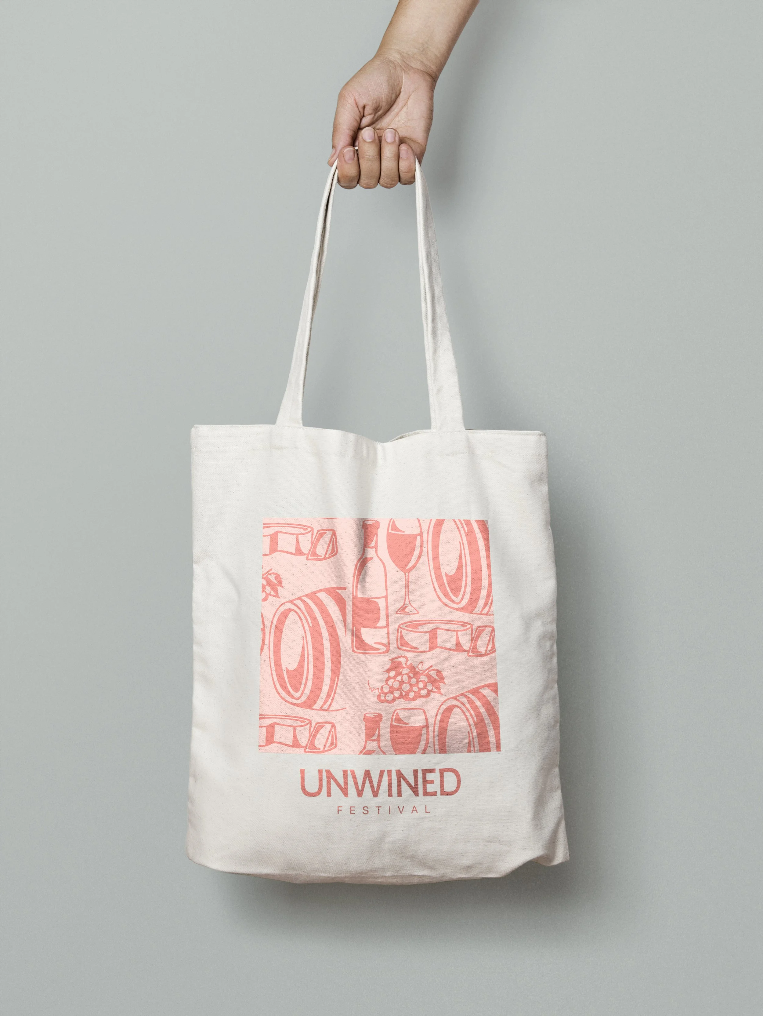
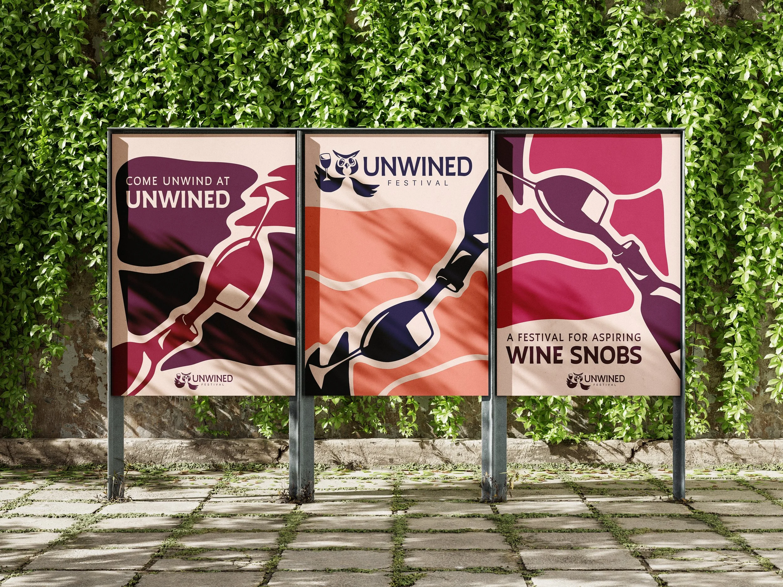
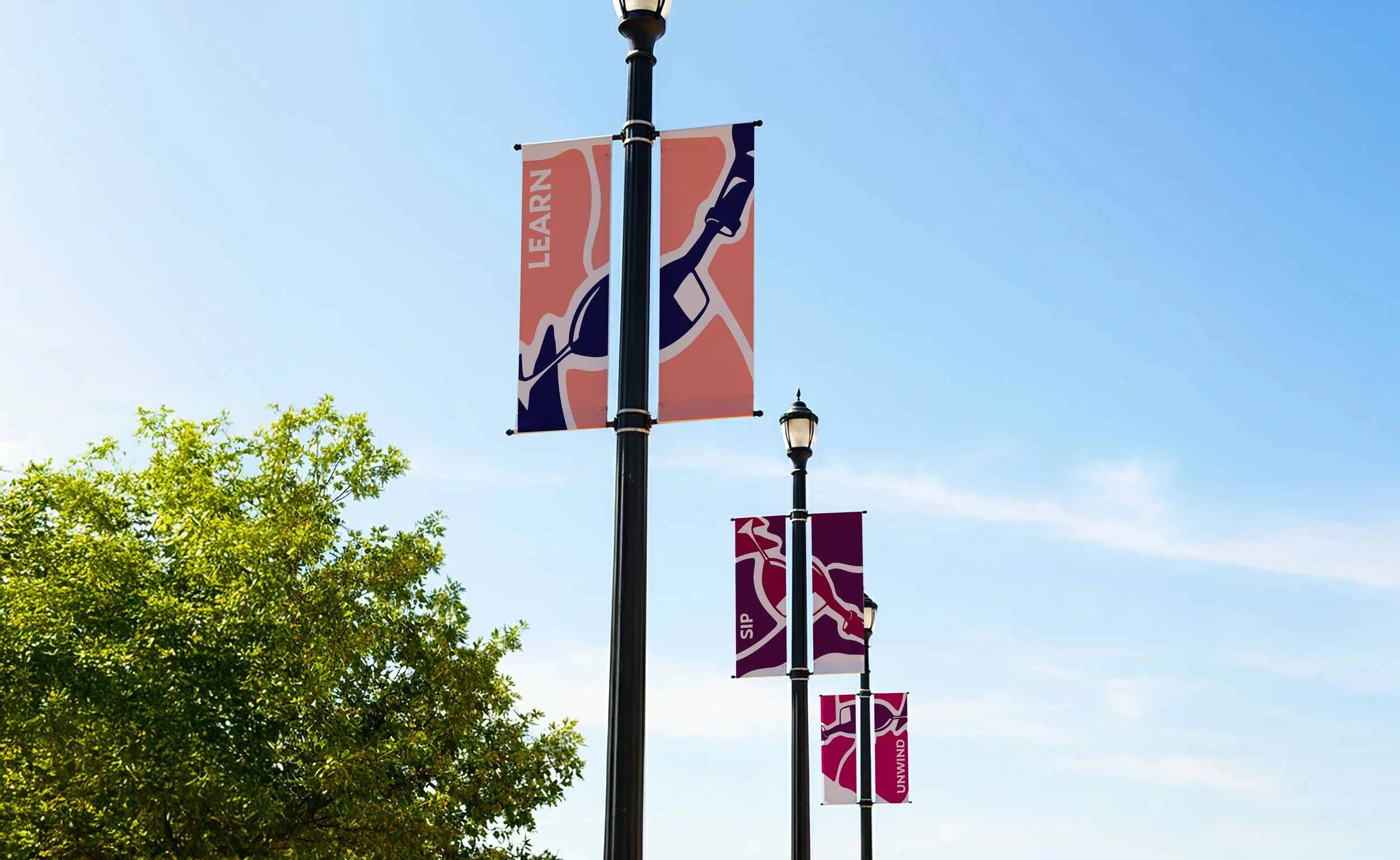
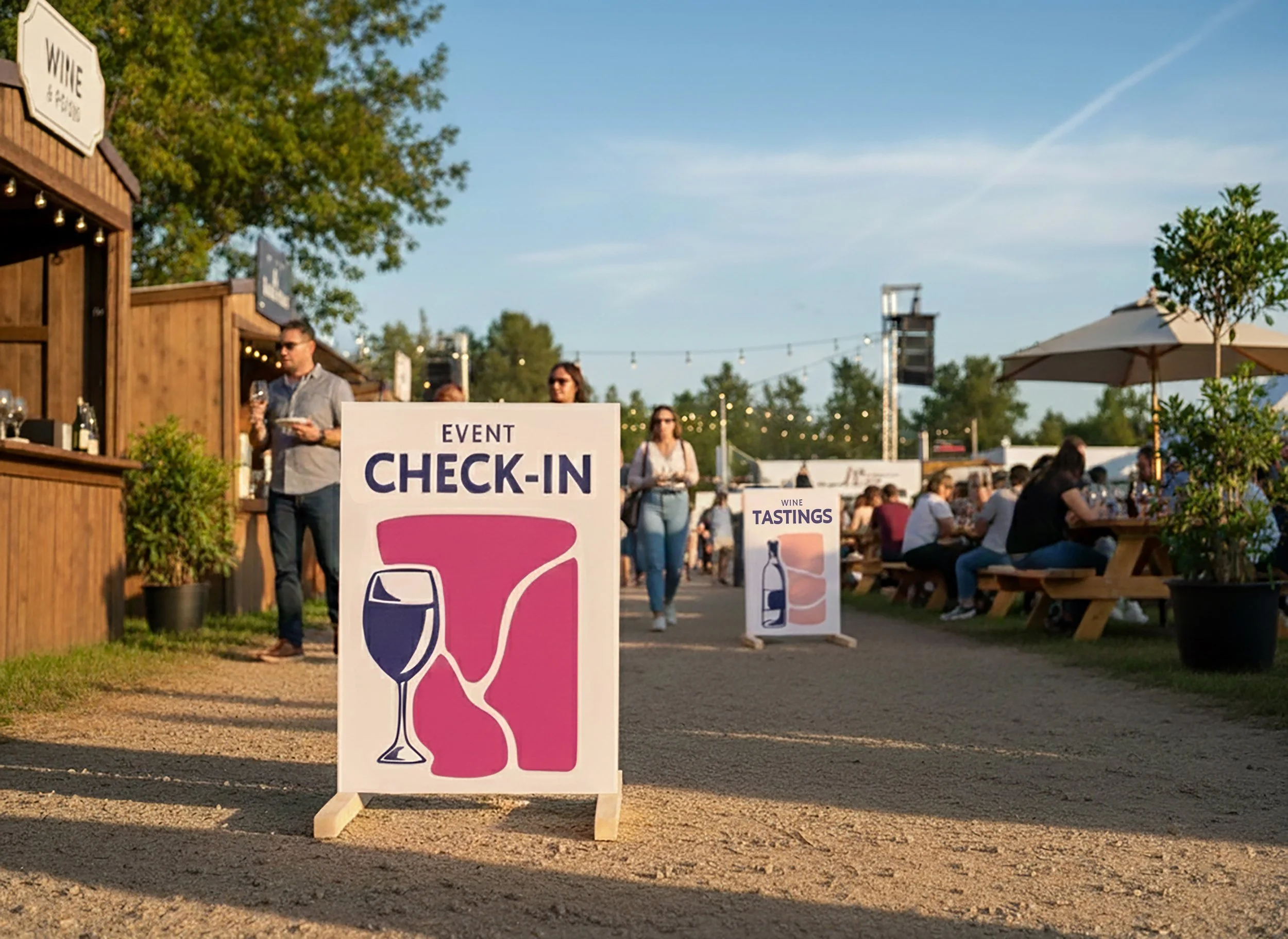
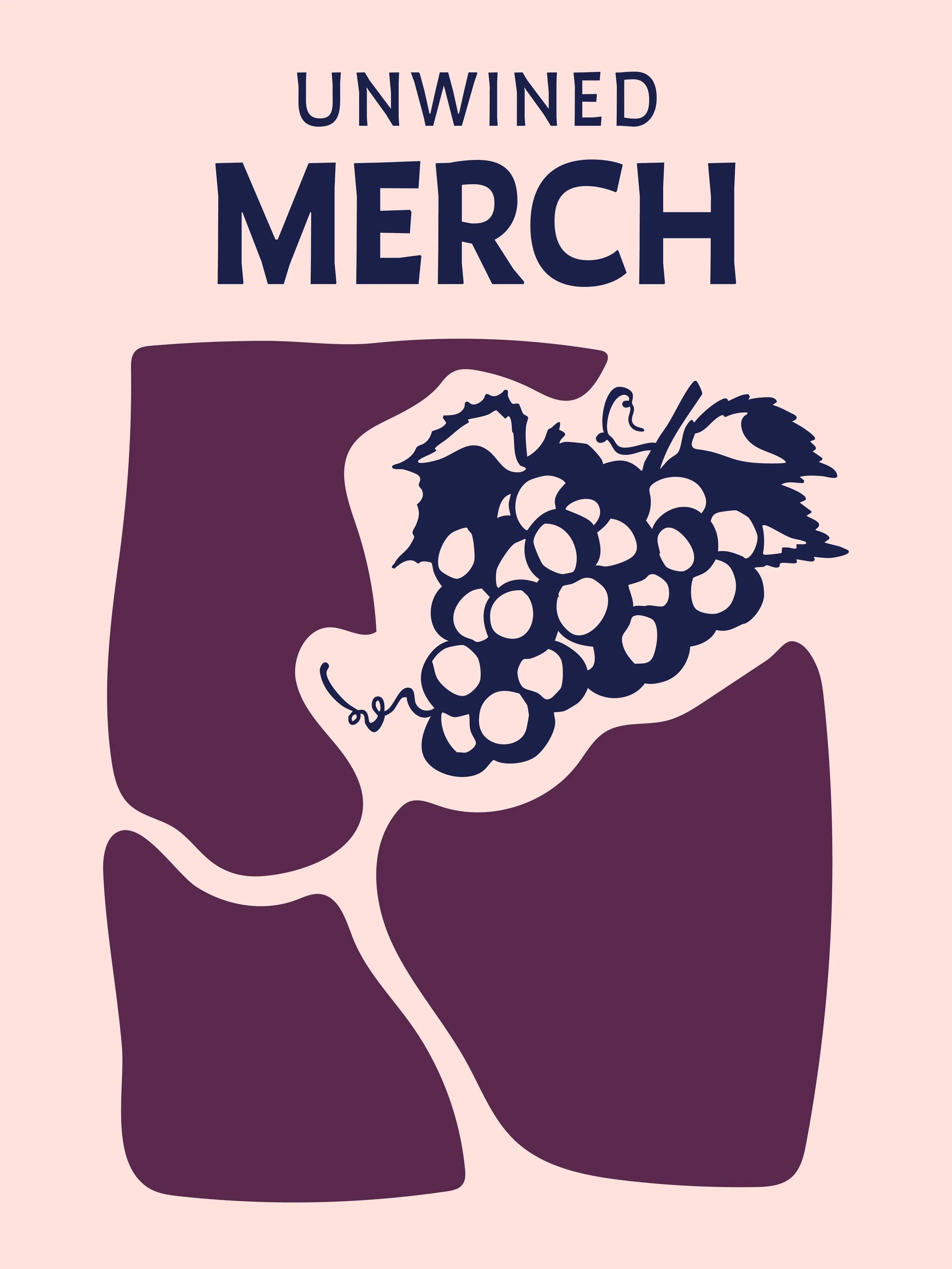
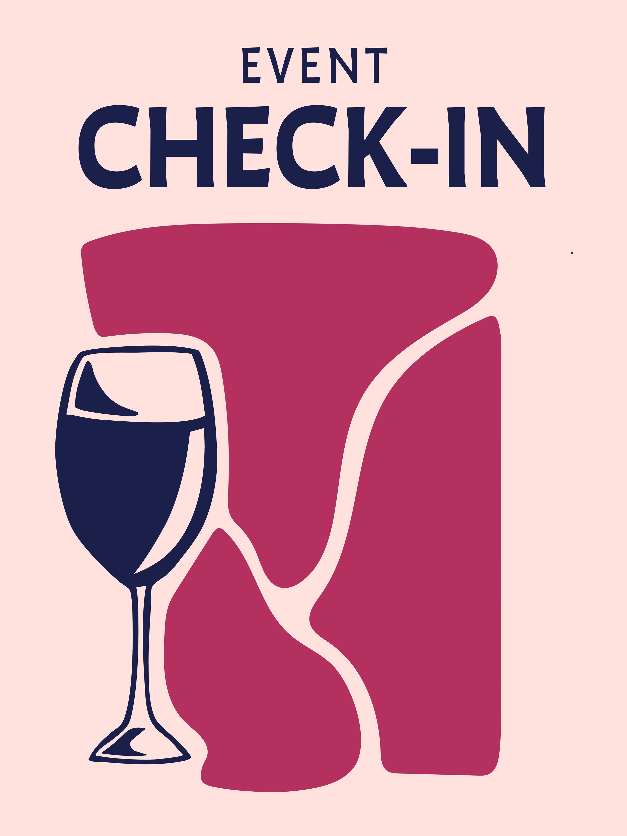
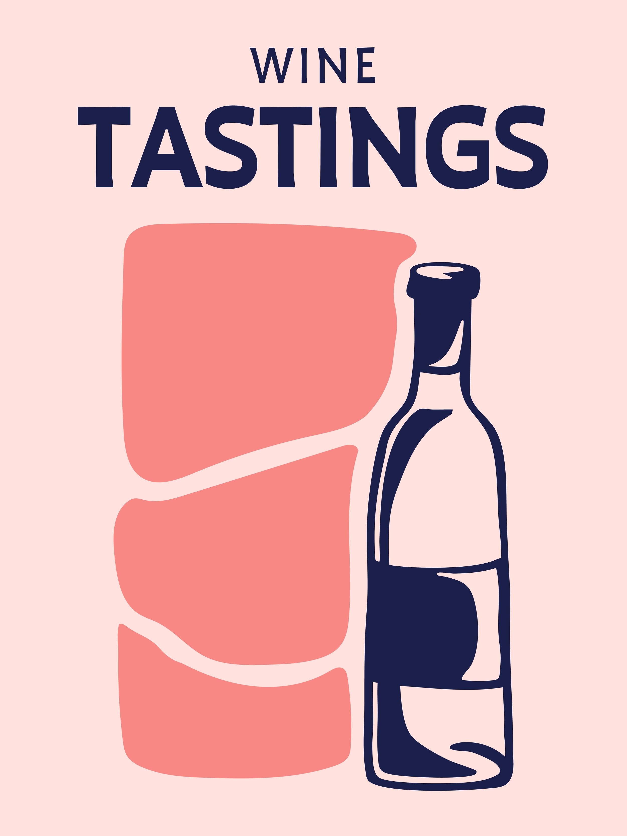
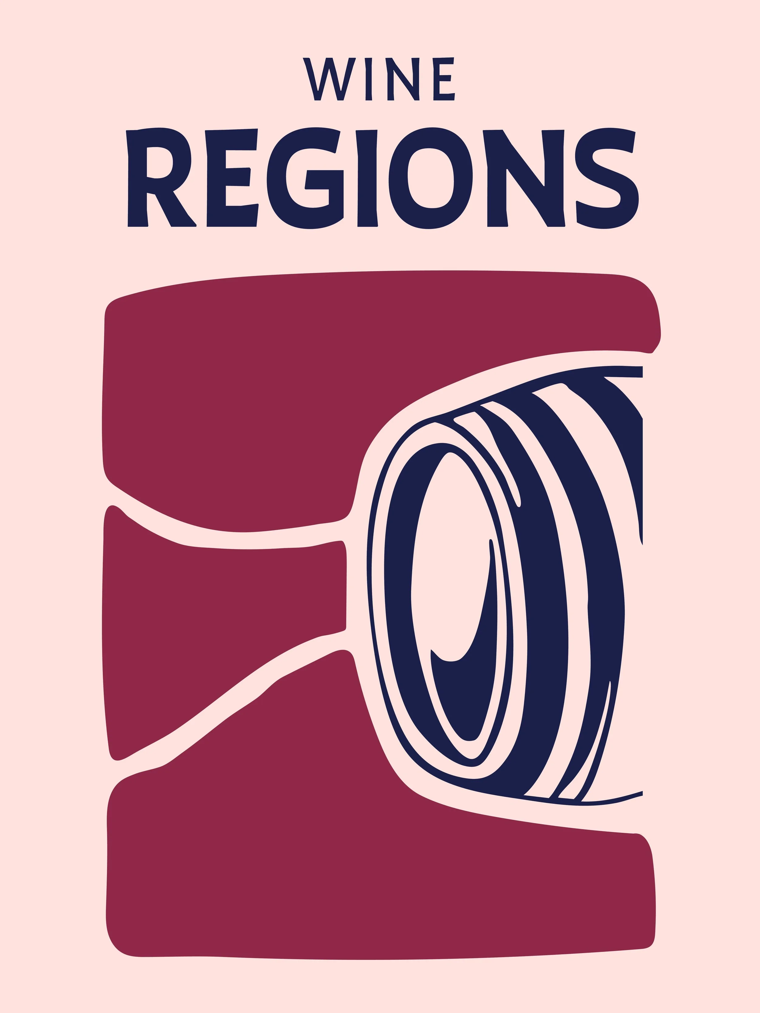
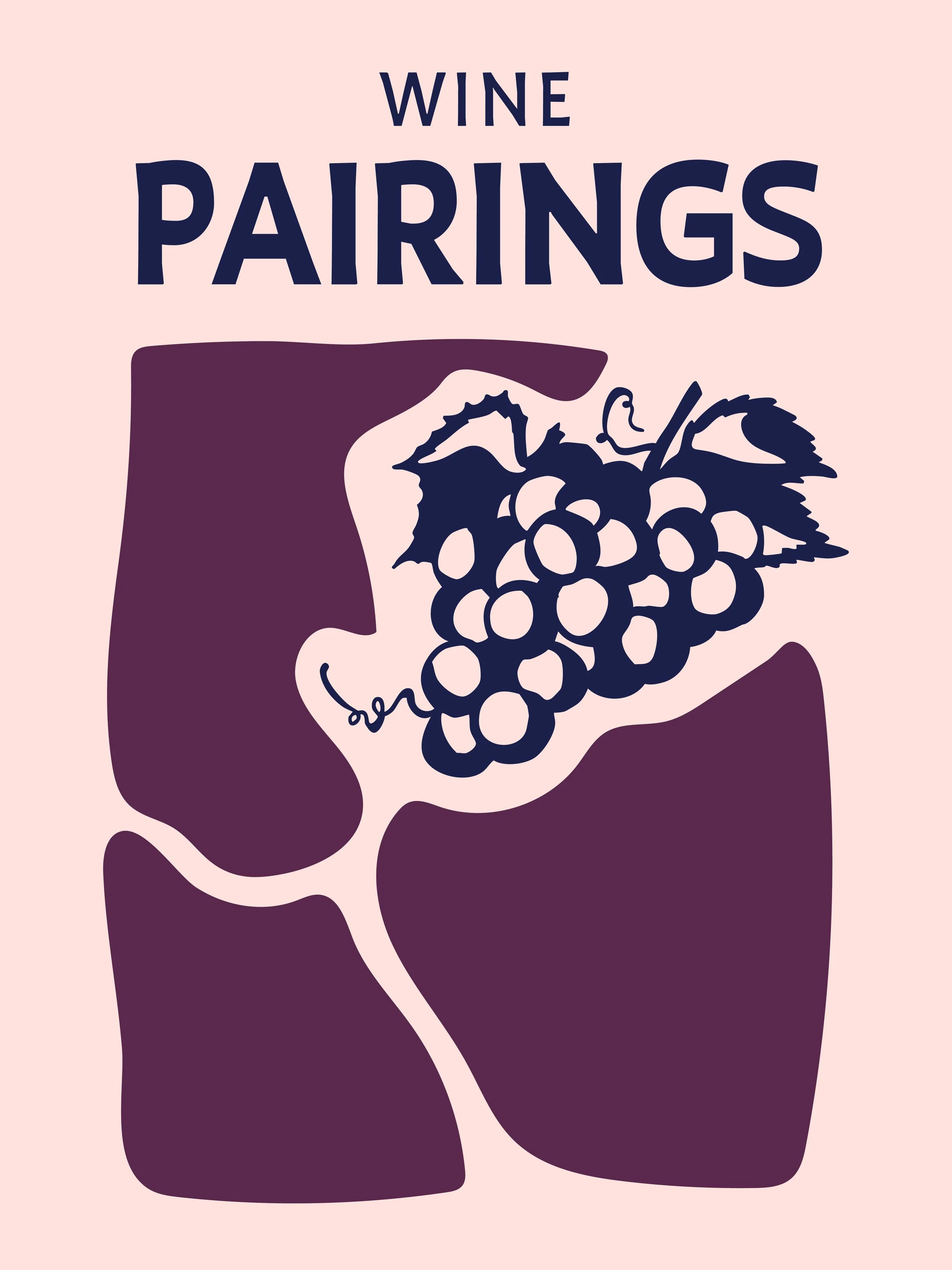
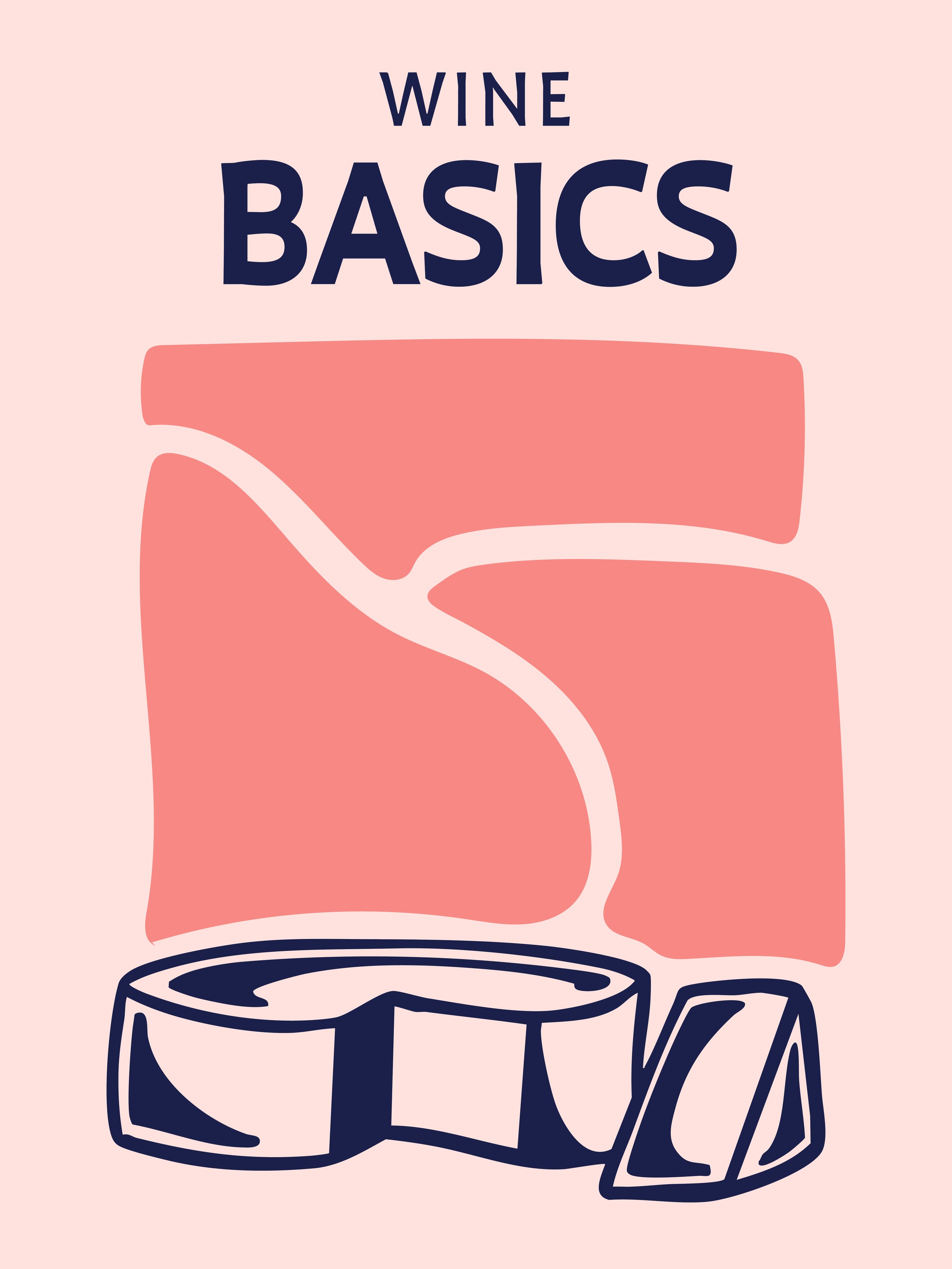
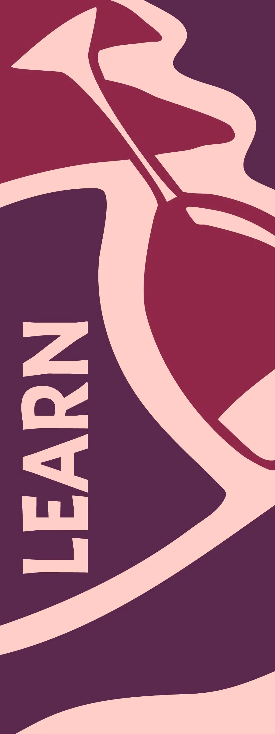
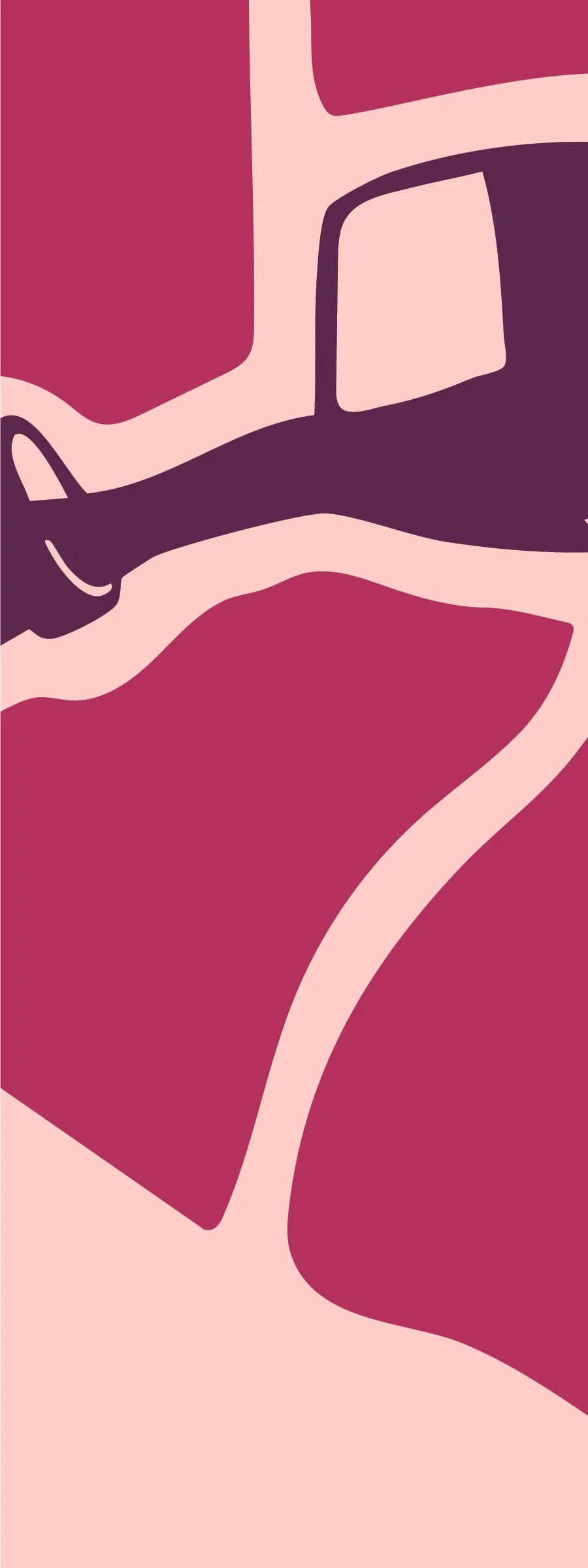
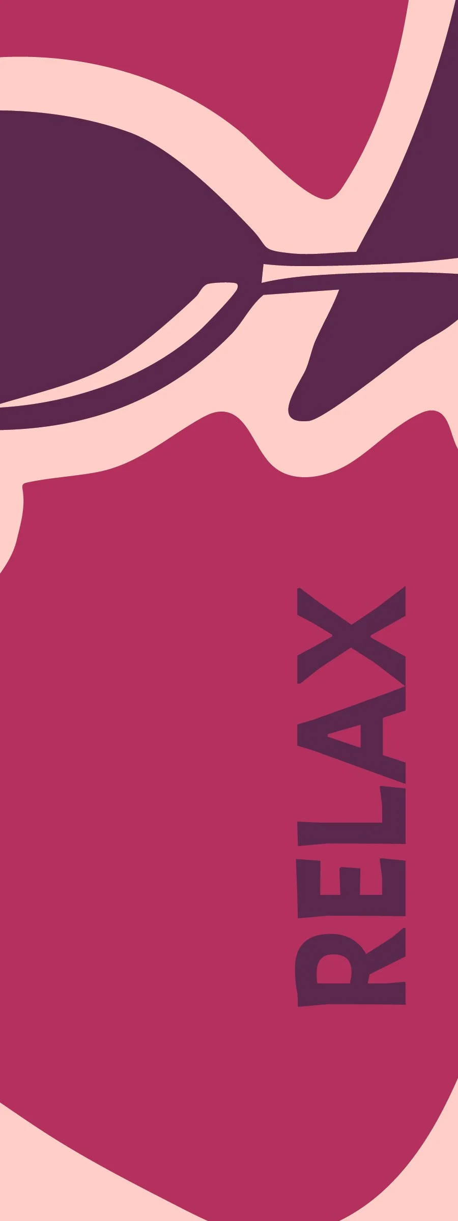
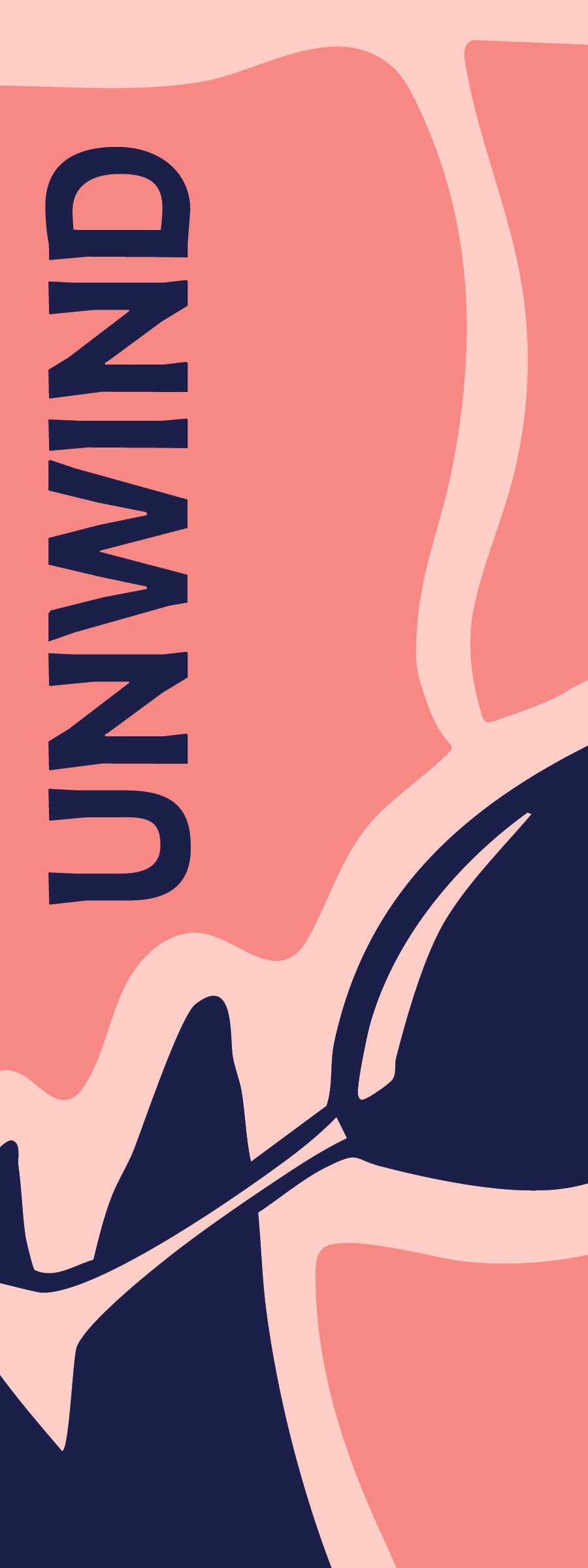
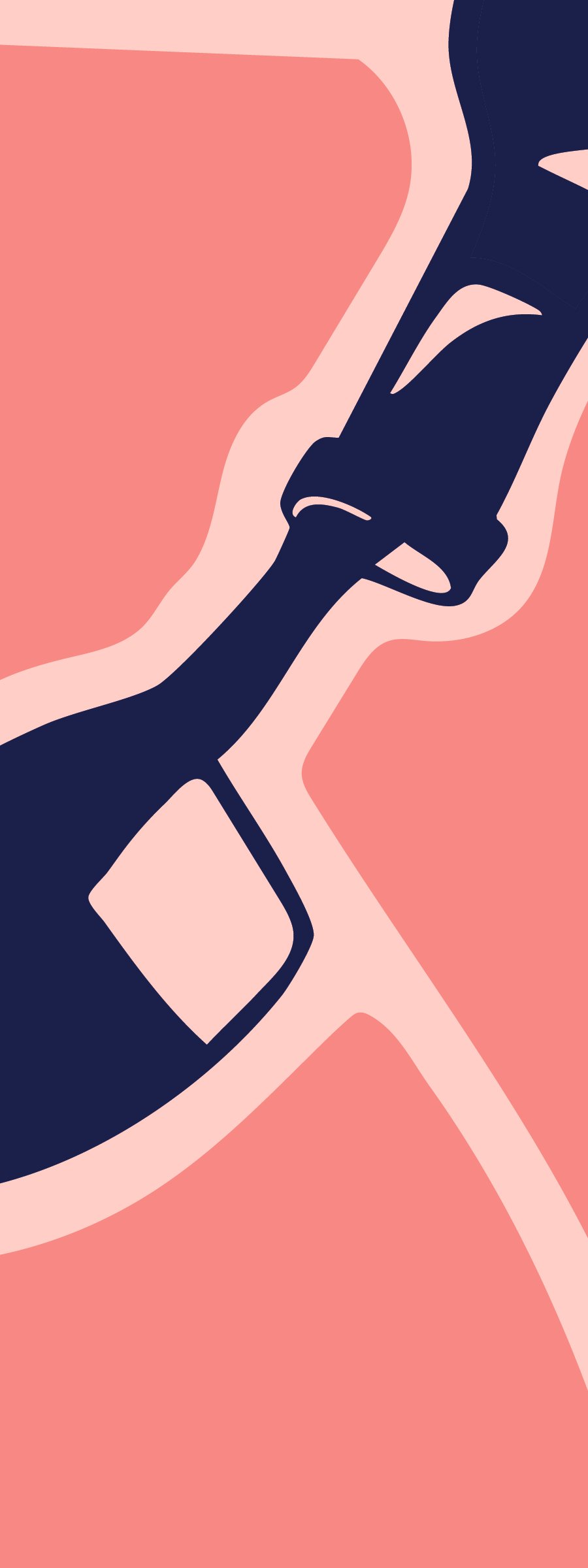
I designed a flexible brand system that could scale across a variety of sizes and mediums. The goal was to strike a balance between playful and sophisticated. The logo features an illustrated owl character who may or may not have enjoyed a few glasses of wine. I chose an owl because they help protect vineyards by chasing away rodents and are also a symbol of wisdom, which is fitting for an event centered on learning about wine. The color palette is inspired by the range of grape varieties used in winemaking, translated into bright, energetic tones that reflect the fun atmosphere of the event. Lastly, organic shapes throughout the illustrations reference the rows of vines found in a vineyard.
Event Branding, Logo Design, Print Design, Illustration